
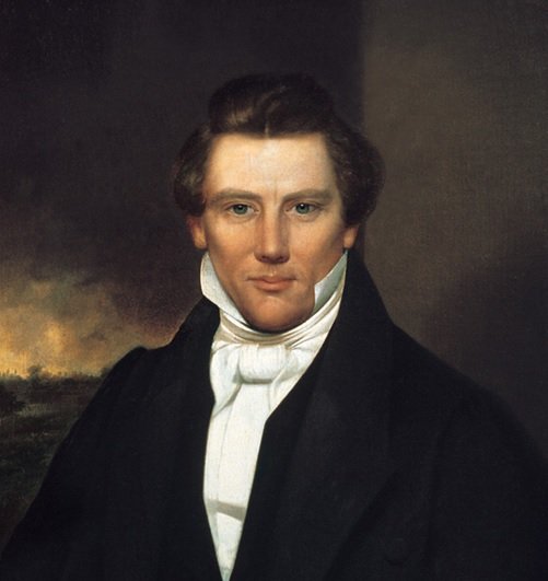
People always have the weirdest images of Joseph Smith added to their posts or dominating the covers of their books. I decided to go looking to see if I could find a picture that made me relatively happy.
In doing so, I tumbled across Kim Marshall’s blog, discussing a 2nd generation unedited photographic print copied from the original daguerreotype of Joseph Smith from 1840-1844. She clearly marks the images on her website as copyrighted, but the painting at the head of this post is obviously based on that original daguerreotype.
[Update – I now agree with those who assert that Kim Marshall’s photographic print is a photo of the painting, though a much nicer photo of the painting than the “photo” Joseph’s son submitted to the Library of Congress, the one with weirdly chopped off hair that is often used in articles talking about Joseph by those outside the faith. I don’t doubt Kim Marshall’s sincerity. However, for a fun tour of what one can do with photoshop, check out these images of Rowan Atkinson suggesting a lifespan extending centuries.]
Some of the fun things:
- Joseph looks like a wonderful man in the unedited picture. Edited versions of this picture look somewhat creepy, and the profile pictures painted during Joseph’s lifetime look rather uninspiring and stiff.
- Careful examination of the photo, as Kim Marshall has done, shows that Joseph’s left eye shows scarring, consistent with the way his left eyelid to droops slightly and his left eye turns inward slightly, a condition called Esotropia. This explains why we always see his right profile in drawings done during life.
- A detailed analysis of the painting shows that it was likely painted by Selah Van Sickle in 1845, from the photographic image.
- The photograph shows the visual evidence in life of the injuries we can discern in the pictures of Joseph’s skull.
Perhaps this is old news to some of you, but I live out east where information of interest to Mormons isn’t broadcast on local TV channels (not that people watch much TV anymore…).

New Post: Seeing Joseph Smith: People always have the weirdest images of Joseph Smith added to th… http://t.co/brruRTqDhU #LDS #Mormon
TheMillennialStar: Seeing Joseph Smith http://t.co/XUBSUFqG5H #lds #mormon
I’ve seen this picture a few times, but never noticed the lazy eye. Interesting.
For what it’s worth, I live in New Mexico, and we don’t have LDS news of any kind either.
Joyce, are you looking at the picture in this post (a nice painting based on the photograph) or did you click the link to go to Kim Marshall’s website to see the actual photograph?
I found her blog because I saw her superposition of the photograph over the death mask, which was quite striking.
I think I forgot to mention the broken nose. You can see it somewhat in the painting, but more so in the photograph. Poor Joseph surely had collected an assortment of wounds by the time he got to Nauvoo. I’m not sure if he’d gone through the pistol whipping before or after this photograph was taken (speaking of the photograph on Kim’s blog page).
I have done a lot of research on the subject while preparing to make artwork that featured Joseph Smith. This image is a painting based on a photograph of a painting. An artist made two paintings of the Prophet and Emma. Joseph admired and approved of Emma’s portrait but he was dismissive of this image saying it made him look like a pretty boy. Some of the idealizations the artist indulged in include making the nose more narrow, making the face more triangular, reducing the space between the eyes and their size, which was enhanced by long lashes. He reduced the convex appearance of Joseph’s face. In fact Joseph’s brow sloped toward the brows, the strong nose protruded and the lips and chin receded in a somewhat convex line. The profiles are based on tracing the shadow cast by a light placed behind the subject, therefore as far as the outline goes, they are accurate. As a portrait artist I sometimes have to fight the urge to ‘improve on nature’ and each era has an idealized image of male and female attractiveness that can be detected in the work of minor artists. Joseph was powerfully attractive but his looks were not conventional for that era. He had a genial appearance, likely smiling often and revealing the tooth broken when he was tarred and feathered. One of the most accurate paintings of Joseph is by Alvin Gittens who based his picture of the prophet on the death mask, the profiles, and contemporary descriptions.
Hi Pat,
Did you click on the links to see the actual photograph? Because the owner of the photograph has copyrighted all images at her site, I am not at liberty to post any of them here. So I posted the painting, which she makes a strong case couldn’t have been painted until 1845, and therefore could never have had Joseph’s reaction. If he was reacting to a photograph that made him look like a pretty boy, that’s just too bad.
After following the link my comments stand. Notice the cute, small nose on the image. That is one of the significant tells that it is idealized, and a photo of the painting. I have spent many hours studying the subject of images of Joseph. There is a vast body of discussion about the subject by interested artists and historians. Recently a photo has surfaced that many believe is the one possible photograph of the prophet because of its uncanny correspondence to the death mask. However there is no extant actual photo of the prophet with a proven provenance.
I did click over to Kim Marshall’s blog. It was fascinating.
Sigh.
There’s the colorized thing she did.
I will defer to the artist. I think it was the first post on her blog were she put an overlay showing the similarities and differences between her picture and the painting. But as all this is presented digitally, things could be otherwise. She also had a discussion about depth of field, etc. But the exactness with which clothing elements of the picture and painting match is a bit too close. This would be explained if the painter were using Vermeer’s technique, but why would we think he was using Vermeer’s technique, or a variation thereof?
I was being happy believing the arguments about the added details that aren’t in the painting. But if it ain’t so, it ain’t so.
I do like the picture, though, even if it is just a doctored picture of the painting that has been modified to look like a photo…
By defer to the artist, of course, I meant Pat.
This is one of my least favorite pictures of Joseph Smith. My problem is the staring eyes and the all too angular and strong lines. To me it is overdone.
I learn something new about Joseph all the time. I had no idea that actual pictures of his skull were taken back in 1928. Wow.
As a result of seeing this post, I found a lengthy online analysis of this photo done by Reed Simonsen that was fascinating, and compelling. You can find it here: http://www.photographfound.com/
I don’t know if his analysis is scholarly, or just a pet project that he is promoting, but the historical facts, particularly the summary of Joseph Smith III’s taking the photo to the Library of Congress, suggests to me that he thought this image an accurate depiction of his father. And he would certainly know! In addition, I cant imagine why he would try to perpetuate a record that was inaccurate.
On the other hand, when I contacted a historian that works for the Church, she dismissed this image as a photo of a painting and pointed me to this article in Sunstone: https://www.sunstonemagazine.com/pdf/140-18-27.pdf I’d like to know what facts that assessment is based on. It’s an interesting mystery!
Whoops, I misspoke in the above post. The image that Reed Simonsen analyzes is a different one than the image in this post, but quite similar. His contention is that this image is based on the original daguerreotype, which he believes he has a copy of, sent to him from the Library of Congress.
Look at the death mask, then the image. The nose is not the same. Although the events at Carthage were violent, there is no record that Joseph was beaten in a way that would cause his nose to swell. Another anomaly of this image may be an artifact of the angle the subject image was set at. I often photograph paintings for publication in a newsletter I publish. It is important to take the photo exactly perpendicular to the subject image or it will suffer distortion. Relative to other almost identical images, the face in this one is just a bit broadened. The perpetuation of the idea that this is an actual photograph of the prophet will likely continue as long as people find it appealing and stop short of due diligence.
Actually, this is a delightful example of the fact that I sometimes get enthusiastic about something, but when the fallacies in my logic are pointed out, I’m more than happy to realize I was wrong.
So in order for the photograph to be the source of the painting, rather than the other way around, the painting must have been produced by an extremely faithful method, such as the one used by Vermeer to produce his artwork (see Tim’s Vermeer). However it isn’t credible that an otherwise little-known artist *who was bad at executing clothing* could have used this method to produce the painting from the photograph.
The distortions between the painting and the photo are explainable by the difference between a picture taken of a painting and a scan of the painting itself. In fact, that very comparison shows uncanny exactness in elements of the clothing between the painting and the photograph that are not like actual clothing (the odd way the collar interacts with the left jaw, the cuff on the right wrist).
Still, I rather like the image that results from projecting the “photo” onto the death mask to match the placement of the eyes and chin. This gives the sense of proportion that is as true to Joseph as the death mask could be expected to be, as well as the vitality of a painting that appears to have been credibly executed during a time when at least Joseph’s intimates were available to provide critiques.
Regarding the nose, the explanation Kim Marshall gave was that they had stuffed cotton up the nose as part of the process of making the death mask.
However as Joseph apparently made the comment that some picture of him in life made him look like a “pretty boy,” this picture could well have been the one he was speaking of. In which case, it might have had the benefit of being executed from life.
Cotton up the nose would widen the nostrils, not the fleshy tip of the nose. The portrait from which the image in question originated was painted from life in Nauvoo in 1842 and it is owned by the Community of Christ. Along with the death mask and the profiles by Maundsley, it is the only image of the prophet. Some old daguerretypes have been suggested as possible portraits but lack provenance.
So poor Joseph is only truly “captured” by a face-on painting he thought made him look effeminate, profiles, and a death mask.
Was the portrait I have in this post painted at the same time as the picture of Emma with the gold bead necklace? They make a handsome pair of portraits, as I recall.
Although you can guess by the questions this painting brings up, it cannot be proven if they were done by the same artist. However, I too agree that the two of this and the Emma one make a fine companionship. The fact I even know what one you are talking about with Emma is a hint they might be done by the same person. For some reason, the two side by side soften what I don’t like about this one on its own. Go figure.